
In the Beginning…
…there was a painting. Several in fact. I do a lot of art in various media—jewelry, pottery, graphic art, drawing…but I do not paint a lot. My mother did, though. I grew up with oil paint. The odors of turpentine and linseed oil brings back happy memories of my childhood.
My house is full of her paintings—from the Realism of the 1950s, the Abstract Art of the 1970s…Landscapes in the 1980s, and in the 1990s she switched to watercolor and went all in for Abstract Realism, or Real Abstractions.
Before Watercolor and after Oil Paint, acrylic paint showed up, thanks to Ives Klein’s International Blue and a French chemist revolutionizing paint. Mom tossed her oil paints over her shoulder and never looked back.

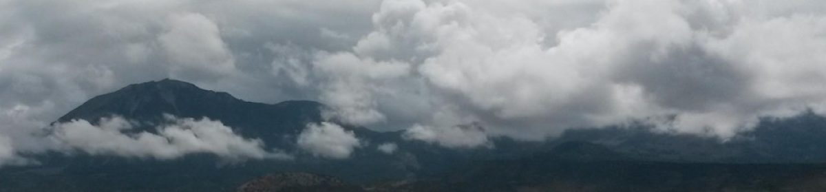
My mother and I did some art together—as in sitting side-by-side drawing. We’d go out east of the Sandia Mountains that overlooks my childhood home of Albuquerque, and draw the weathered shacks and corrals and the old church just off the highway in Golden whose existence came about through a brief history in (wait for it!) a brief history of gold mining.
We also liked to stop up the road in Madrid (pronounced MAD-rid), and sketch the old houses built during the coal boom that had lasted til the 1950s. Almost everyone moved out, Madrid became a sparsely populated ghost town among the ruins of the old houses built during its heyday. (Or is it “hayday”?)

The old houses were interesting to sketch, while imagining the ghosts that might still be there. Anymore Madrid is a tourist town—all the houses that weren’t falling down have been renovated, and people live in them, as well as operate coffee shops and art galleries out of them.
The film, Wild Hogs was filmed in and around Madrid…
In the 1950s, my mother, Rita M. Simmons, named the highway that we drove to get to Golden and Madrid. It was Highway 10, name changed to Highway 14, and now is Highway 337. But the highway through Golden, Madrid, and its sister tiny town with a copper mining history, Cerrillos further up the road, comprise what has been known since the 50s as the Turquoise Trail.
She won a set of luggage.
Ok, then…where am I? Oh–yes, my book cover.
If not for my mother, I may not have painted it. If not for my mother, I may not have done any of the artwork that has informed my life on Earth.
Corvus Rising’s book cover is not all paint, however. It’s more a multi-media event featuring watercolor, ink drawing, clip art, and of course Photoshop.
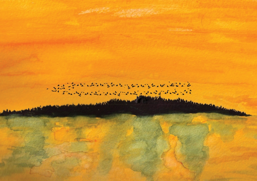
I painted the background of Wilder Island, and the river at sunset. Or sunrise. With the dark forests reflected in the water. There were several attempts. I cut them up and made bookmarks out of them. Here’s what made the cut, in its original form:

Then the crows came. After the old hermit, Maxmillian Wilder died on Halloween in 1937, thousands of crows and ravens flew in a circle above the island, in mourning. A local photographer, Frederick T. Nelson, snapped the photo and titled it Murder of Crows. In Alfredo Manzi’s time, the photo hung in the Ledford Library.
In my time, I scanned the watercolor painting, hauled it into Photoshop and applied a gazillion actual clip-art crows and ravens flying in a circle above the island. This is the banner image on my Corvus Rising Facebook page.
Next, in Photoshop, I altered a photograph of a tree, and added corvids–also via altering a photograph and copying it a bunch of times. Like 13. That’s how many corvids are in the Great Corvid Council

And now the text…
Publishers have all sorts of rules about book covers—things like how large the font can be on the spine, how much room the fold will take up, and arcane things like slug and bleed—which have to do with the margins around the actual size of the cover. It’s good to pay mind to that so that important things like the last letters of your title or an important part of the cover art doesn’t get chopped off at the printers.
Fortunately, the publishers provide this information and there are many sources to find templates so that cover art and text where you want them. Here’s some screen shots of the guidelines that I used to layout my book cover in Photoshop.

Front Cover and Spine Text……………………Back Cover Text added…………………Barcode, Publisher’s icon added
In Photoshop, I just typed what I wanted—the Title, or my name, or the back cover text— in a layer over the cover art. And I moved it around and played with fonts and sizes and places until it looked “right”.
It’s tricky to have a complex book cover with lots of colors and make the text show up. So I had to do things like fade out a portion of the spine so the title would be readable; make a separate line of text in a different color over the island on the back cover so it would show up.
For Paperbacks, a Barcode is required, which you get when buy an ISBN# (don’t!—unless you plan on writing a whole bunch of books. One is pricey, and though there’s a price break at 10, it’s still a hundred or so bucks…and 10 is likely more books than I will probably write). Amazon will give an ISBN# and its barcode for free–they buy them by the thousands so one of these things are essentially free to them too.
eBooks do not need barcodes, but like print books, need to have an ISBN#….which gives info on price, who the publisher is, where the book was published, etc. ISBN means International Standard Book Number, and has nothing whatsoever to do with author’s ownership of books… <more about isbn’s here>
Lastly I placed the Barcode (there’s rules about barcodes too…how big, where to place, etc), my webpage address, and a little mouse, for “Ecofantasy Press”–which is my own privately owned publishing company.
That’s one cool thing about self-publishing…being your own publishing company. Not to be confused with who actually physically produces the book in print.
The Whole Enchilada…

BY THE WAY….I am on the downward side of finishing Book 2, by the way, after 7 years…


You must be logged in to post a comment.