My Mother, My Bookcover …

In the Beginning…

…there was a painting. Several in fact. I do a lot of art in various media—jewelry, pottery, graphic art, drawing…but I do not paint a lot. My mother did, though. I grew up with oil paint. The odors of turpentine and linseed oil brings back happy memories of my childhood.

My house is full of her paintings—from the Realism of the 1950s, the Abstract Art of the 1970s…Landscapes in the 1980s, and in the 1990s she switched to watercolor and went all in for Abstract Realism, or Real Abstractions.

Before Watercolor and after Oil Paint, acrylic paint showed up, thanks to Ives Klein’s International Blue and a French chemist revolutionizing paint. Mom tossed her oil paints over her shoulder and never looked back.

Church in Golden, New Mexico

My mother and I did some art together—as in sitting side-by-side drawing. We’d go out east of the Sandia Mountains that overlooks my childhood home of Albuquerque, and draw the weathered shacks and corrals and the old church just off the highway in Golden whose existence came about through a brief history in (wait for it!) a brief history of gold mining.

We also liked to stop up the road in Madrid  (pronounced MAD-rid), and sketch the old houses built during the coal boom that had lasted til the 1950s. Almost everyone moved out, Madrid became a sparsely populated ghost town among the ruins of the old houses built during its heyday. (Or is it “hayday”?)

Miner’s Cabins, Madrid, NM

The old houses were interesting to sketch, while imagining the ghosts that might still be there. Anymore Madrid is a tourist town—all the houses that weren’t falling down have been renovated, and people live in them, as well as operate coffee shops and art galleries out of them.
The film, Wild Hogs was filmed in and around Madrid…

In the 1950s, my mother, Rita M. Simmons, named the highway that we drove to get to Golden and Madrid. It was Highway 10, name changed to Highway 14, and now is Highway 337. But the highway  through Golden, Madrid, and its sister tiny town with a copper mining history, Cerrillos further up the road, comprise what has been known since the 50s as the Turquoise Trail.
She won a set of luggage.

Ok, then…where am I? Oh–yes, my book cover.

If not for my mother, I may not have painted it. If not for my mother, I may not have done any of the artwork that has informed my life on Earth.
Corvus Rising’s book cover is not all paint, however. It’s more a multi-media event featuring watercolor, ink drawing, clip art, and of course Photoshop.

I painted the background of Wilder Island, and the river at sunset. Or sunrise. With the dark forests reflected in the water. There were several attempts. I cut them up and made bookmarks out of them. Here’s what made the cut, in its original form:

Untitled-1

Then the crows came. After the old hermit, Maxmillian Wilder died on Halloween in 1937, thousands of crows and ravens flew in a circle above the island, in mourning. A local photographer, Frederick T. Nelson, snapped the photo and titled it Murder of Crows. In Alfredo Manzi’s time, the photo hung in the Ledford Library.

In my time, I scanned the watercolor painting, hauled it into Photoshop and applied a gazillion actual clip-art crows and ravens flying in a circle above the island. This is the banner image on my Corvus Rising Facebook page.
Adobe Photoshop PDF

Next, in Photoshop, I altered a photograph of a tree, and added corvids–also via altering a photograph and copying it a bunch of times. Like 13. That’s how many corvids are in the Great Corvid Council
WithTree_AndCrows

And now the text…

Publishers have all sorts of rules about book covers—things like how large the font can be on the spine, how much room the fold will take up, and arcane things like slug and bleed—which have to do with the margins around the actual size of the cover. It’s good to pay mind to that so that important things like the last letters of your title or an important part of the cover art doesn’t get chopped off at the printers.

Fortunately, the publishers provide this information and there are many sources to find templates so that cover art and text where you want them. Here’s some screen shots of the guidelines that I used to layout my book cover in Photoshop.

AllCoverText
Front Cover and Spine Text……………………Back Cover Text added…………………Barcode, Publisher’s icon added

In Photoshop, I just typed what I wanted—the Title, or my name, or the back cover text— in a layer over the cover art. And I moved it around and played with fonts and sizes and places until it looked “right”.
It’s tricky to have a complex book cover with lots of colors and make the text show up. So I had to do things like fade out a portion of the spine so the title would be readable; make a separate line of text in a different color over the island on the back cover so it would show up.

For Paperbacks, a Barcode is required, which you get when buy an ISBN# (don’t!—unless you plan on writing a whole bunch of books. One is pricey, and though there’s a price break at 10, it’s still a hundred or so bucks…and 10 is likely more books than I will probably write). Amazon will give an ISBN# and its barcode for free–they buy them by the thousands so one of these things are essentially free to them too.

eBooks do not need barcodes, but like print books, need to have an ISBN#….which gives info on price, who the publisher is, where the book was published, etc. ISBN means International Standard Book Number, and has nothing whatsoever to do with author’s ownership of books… <more about isbn’s here>

Lastly I placed the Barcode (there’s rules about barcodes too…how big, where to place, etc), my webpage address, and a little mouse, for “Ecofantasy Press”–which is my own privately owned publishing company.
That’s one cool thing about self-publishing…being your own publishing company. Not to be confused with who actually physically produces the book in print.

The Whole Enchilada…

Adobe Photoshop PDF

BY THE WAY….I am on the downward side of finishing Book 2, by the way, after 7 years…

Copyright

Landscape Paint and the Chemistry Blues

419px-Johannes_Vermeer_(1632-1675)_-_The_Girl_With_The_Pearl_Earring_(1665)Alchemy reigned at the time Johannes Vermeer painted Girl with a Pearl Earring in 1665. Back in that day, before the Periodic Table of the Elementswhich didn’t show up in until 1869—painters made their own paints from the powders of ground minerals by mixing them with linseed oil.

lapis-lazuli-rough
Lapis lazuli

The pigment in the blue scarf around the head of the Girl with a Pearl Earring, for instance, was made from lapis lazuli, a beautiful but rather expensive mineral to be grinding to a powder.  Unfortunately, linseed oil made the fabulous blue color of this beautiful mineral a bit cloudy.

Linseed oil did that to most of the mineral powders, but there was no way around that in 1665. The mineral powders would be chalky-looking and would not flow onto the canvas smoothly without being mixed with linseed oil.

Better Living Through Chemistry

The Periodic Table going public in 1869 moved the job of creating paint from artists to the laboratory chemist. These days, few artists mix their own paints, or even know what’s in them. I’m a big fan of chemistry, for without it, there is nothing. No rocks, no clay, no paint. And I wonder how they make vivid yellow as well as intense red paint from the same thing. Not a mineral, but an element from the Periodic Table: Cadmium.

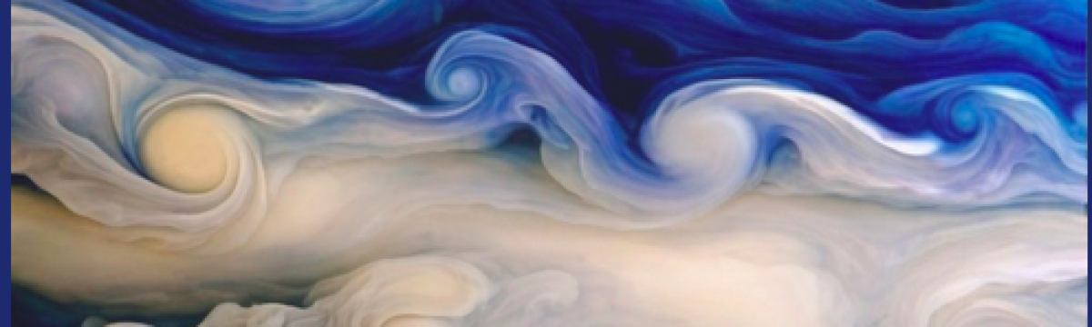
Modern painters can thank French artist, Yves Klein and a few French chemists, who created a rich luscious blue paint that retained the brilliant blue hue by suspension of the dry pigment in a synthetic resin, avoiding the murkiness of linseed oil.

They called it International Klein Blue. Yves Klein used IKB, as this patented pigment is known, to paint Blue Monochrome, part of a series of one-color paintings he had been creating for several years.

BlueMonochrome
Blue Monochrome, Yves Klein, 1961

IKB represented something profound to Klein: le Vide-the Void. Not a vacuum or terrifying darkness, but a void that invokes positive sensations of openness and liberty, a feeling of profound fulfillment beyond the everyday material world. Standing before Klein’s huge canvases of solid blue, many report being enveloped by serene, trance-like feelings.

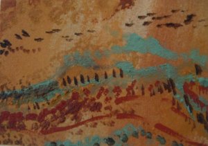
That’s how the Southwestern desert landscape makes me feel.

the-surreal-rock-formations-were-created-over-thousands-of-years-as-water-and-wind-eroded-the-navajo-sandstone

The iron-stained colors of my native land inspired me to make paint from it, in the old way—grinding the minerals to a powder and mixing them with linseed oil. Perhaps because these paints are made from desert clays (see my previous blog Desert Paintings), linseed oil did not make them murky.

35321_1346473504741_6813196_n
Crows Across the Sky, Mary C. Simmons, 2010


Rocking the Paint

Making Paint From the Rocks

I can easily IFlose myself in Earth’s landscapes, especially the rocky ones. The textures and colors tell a story of chemistry, weathering and erosion. And, if providing a scenic backdrop to my life is not enough, with these rocks I make pottery and glazes.

And paint.

The color palette is generally limited to oxides of iron: brown, reddish-brown, tan, yellowish tan, greenish tan–e.g. Earth colors.

Occasionally a little copper shows up, coloring the clay softly green or blue. Pottery glaze colors depend on these denizens of the Periodic Table. And so did paint, once upon a time before IKB.

I started with several gallon-size zip-lock bags of reddish, greenish and one highly yellow clay. The colors are the result of a certain degree of iron oxidation, and finely ground turquoise, which is a copper mineral.

I sifted out all the rocks, twigs, animal bones and other detritus, and let the colored clay settle in large jars of water. After siphoning off the excess water, I poured this clay slurry onto large pieces of gypsum board to dry. The mud cracks were amazing art pieces in themselves.

CuMudHLimonitePM

Painting with Clay

After the clay slurry completely dried, I crushed and sieved each into a fine powder. I added a little linseed oil to the colored clay powder and in a frenzy of inspiration, I painted

The Paintings

SandiaSunset2 What else can I say? Inspired by rocks, enchanted by Earth’s landscape…

Follow this link to Desert Paintings…http://wp.me/P3Fsq9-in